Milan Setup Guide
Milan is a Genesis child theme. Therefore, it requires the Genesis theme framework to function.
 Milan can be purchased on the StudioPress shop, along with Genesis theme framework if you don't own it already.
 As you can see, each "row" of featured posts has slightly different configurations. For example:
 Let's break it down:
 Let's break it down:
 The recommended image size 118x118.
 In Appearance → Customize → Site Layout, you may switch between:
 Milan will preload all the following widget settings on theme activation:
 Let's break it down:
 While you're free to select any color you wish, the accent color looks best in lighter shades.
Milan can be purchased on the StudioPress shop, along with Genesis theme framework if you don't own it already.
Featured Images
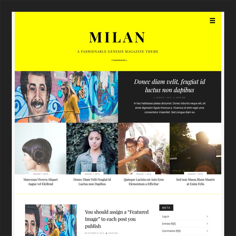
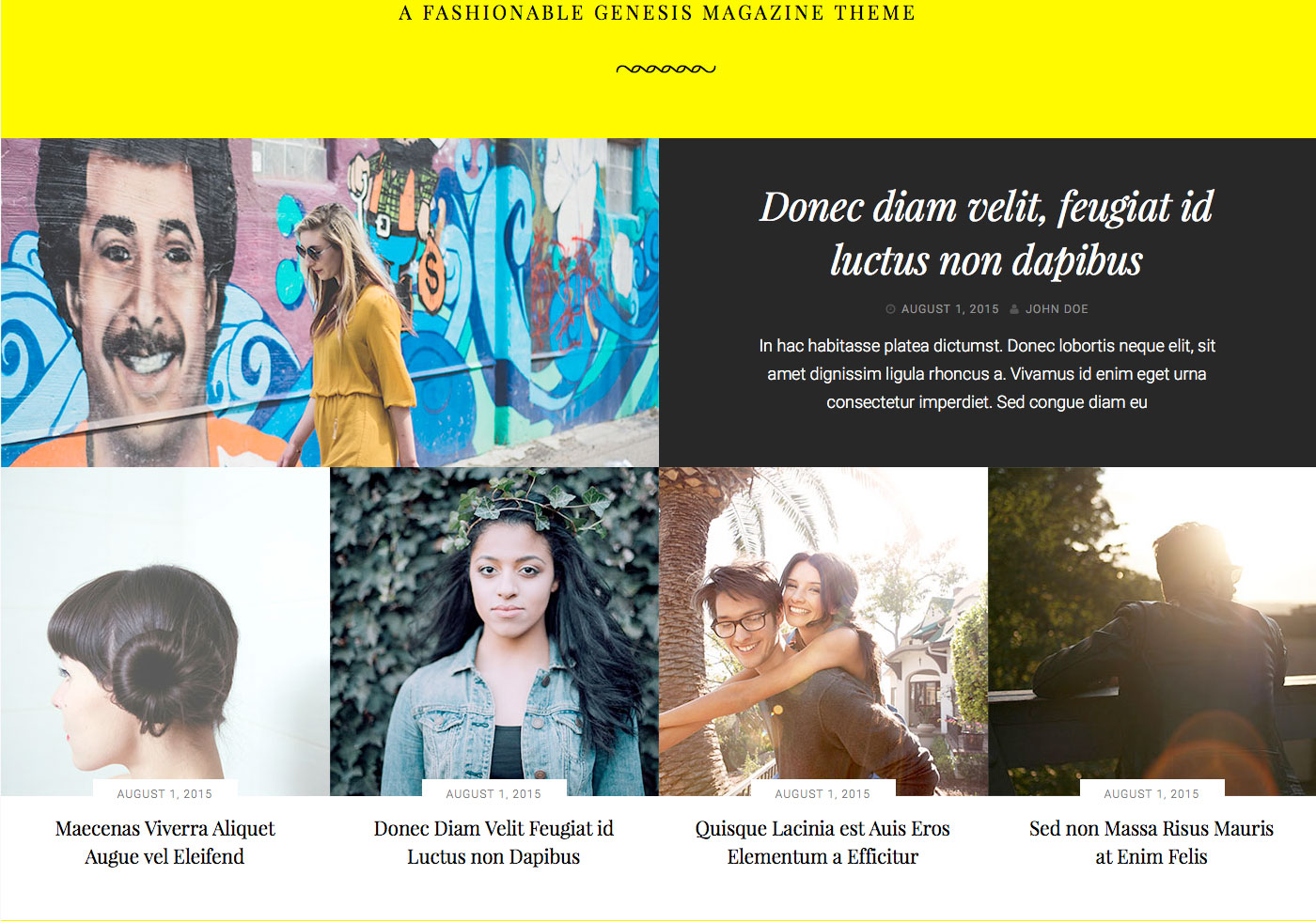
Milan supports the WordPress core post thumbnail (also known as "featured image") functionality. It is recommended you assign a Featured Image to each post you publish, for maximum aesthetic effect. There are two sizes of Featured Images. There is a 700x350 image size used exclusively on the top featured post. Everywhere else, 350x350 image sizes are used. Featured Images are displayed on blog index pages, archive pages, and search result pages. Note that Featured Images are not automatically displayed on single post pages. They will have to be manually placed in the post content, should you choose.Featured Content
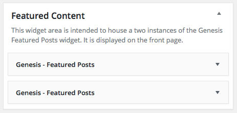
Note: Milan Pro 1.1.0 supports Jetpack Featured Content. For an easier set up, please consider using Jetpack Featured Content instead of the widget-based set up described below. More details in the Milan Pro 1.1.0 theme update blog post. Milan features a widgetized area located on the front page of the site, directly below the header on the Latest Posts page. It houses a total of five featured posts inside of two Genesis Featured Post widgets.
As you can see, each "row" of featured posts has slightly different configurations. For example:
- The top featured post displays an excerpt from the post content, while the row of featured posts below do not.
- The top featured post displays the date and author, while the row of featured posts below display just the date.
- The top featured post uses a 700x350 image size, while the row of featured posts below use a 350x350 image size.
Top Featured Post Settings
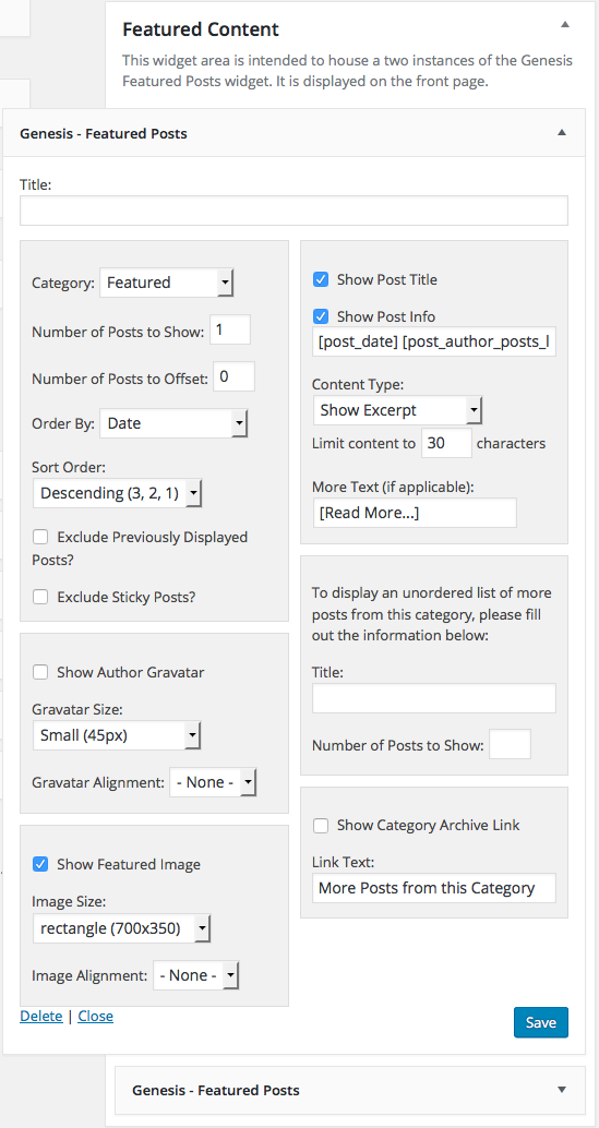
Let's break it down:
- Number of Posts to Show: 1.
- Show Author Gravatar: unchecked.
- Show Featured Image: checked.
- Image Size: rectangle (700x350).
- Image Alignment: None.
- Show Post Title: checked.
- Show Post Info: checked
[post_date] [post_author_posts_link]. - Content Type: Show Excerpt.
- Limit content to 30 characters.
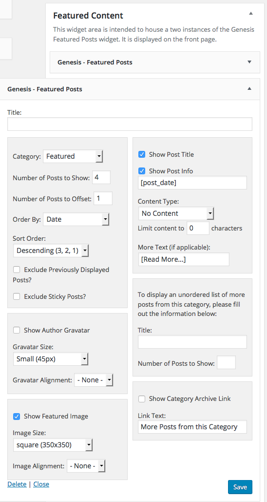
Bottom Row Featured Post Settings
Let's break it down:
- Number of Posts to Show: 4.
- Number of posts to Offset: 1 if using the same category as the top featured widget.
- Show Author Gravatar: unchecked.
- Show Featured Image: checked.
- Image Size: rectangle (350x350).
- Image Alignment: None.
- Show Post Title: checked.
- Show Post Info: checked
[post_date]. - Content Type: No Content.
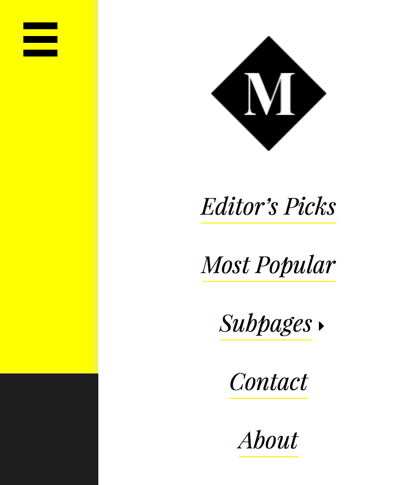
Slide Out Toggle
Milan contains a single menu location, Primary Navigation Menu, which is displayed in a slide out menu when a user clicks on the hamburger menu toggle button in the header. Custom Logo
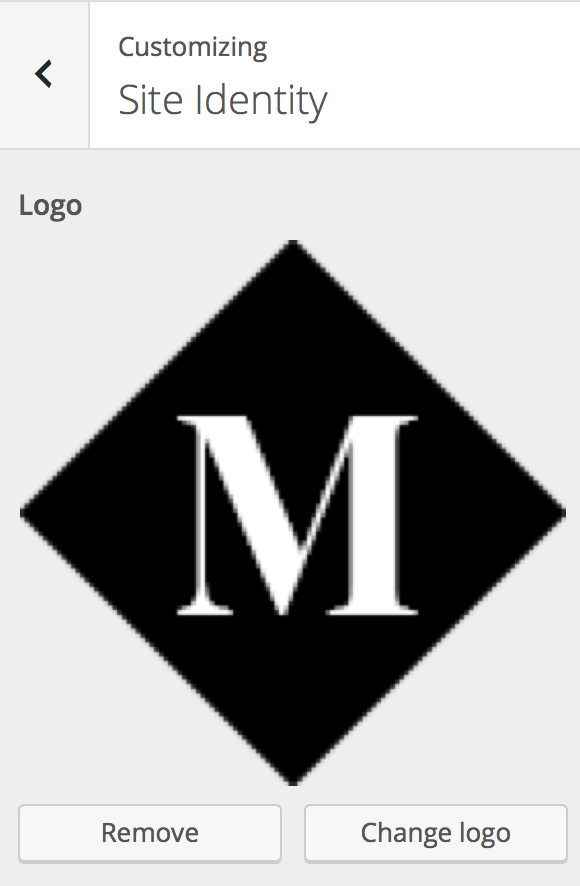
Milan uses the WordPress core Custom Logo functionality introduced in WordPress 4.5. The logo is located directly above the navigation within the slide out toggle, pictured directly above. To add a Custom Logo, navigate to Appearance → Customize → Site Identity.
The recommended image size 118x118.
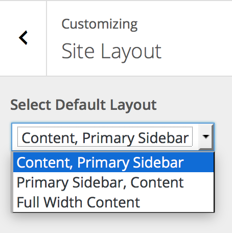
Layout Options
Milan disables many of the Genesis layout options you may be used to.
In Appearance → Customize → Site Layout, you may switch between:
- Content | Sidebar (visible on demo)
- Sidebar | Content
- Content
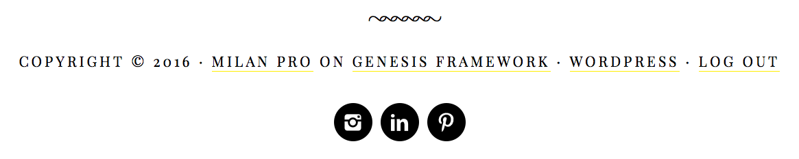
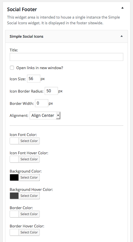
Social Icons
Milan contains a widgetized area called "Social Footer" which is designed to house a single instance of the "Simple Social Icons" widget for Genesis. Simple Social Icons is a WordPress plugin that can be downloaded for free from WordPress.org. You can install it from the WordPress admin or by uploading the zip file.
Milan will preload all the following widget settings on theme activation:
Let's break it down:
- Icon Size: 56 px
- Icon Border Radius: 50 px
- Border Width: 0 px
- Alignment: Align Center
- Icon Font Color: #fff
- Background Color: #000
- Background Hover Color: #404040
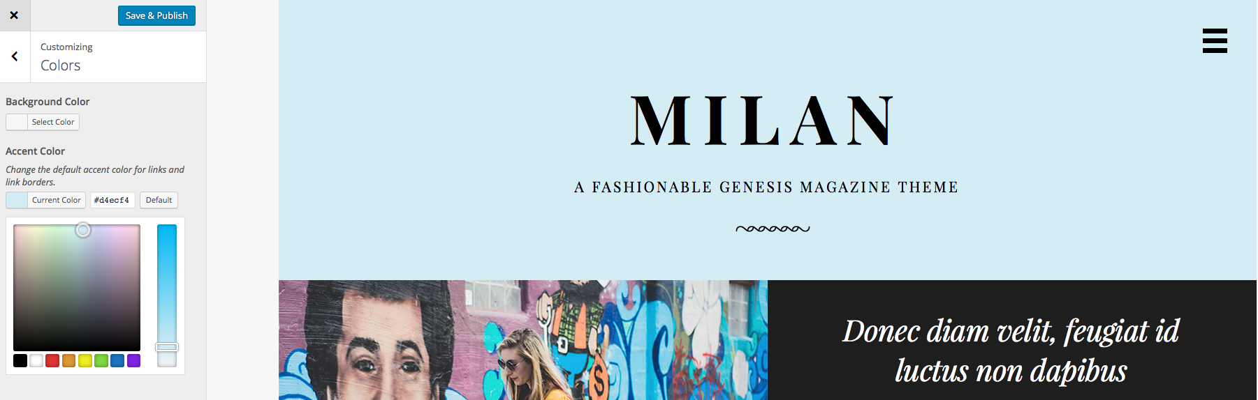
Accent Color
Milan features a simple accent color picker in Appearance → Customize → Colors.
While you're free to select any color you wish, the accent color looks best in lighter shades.